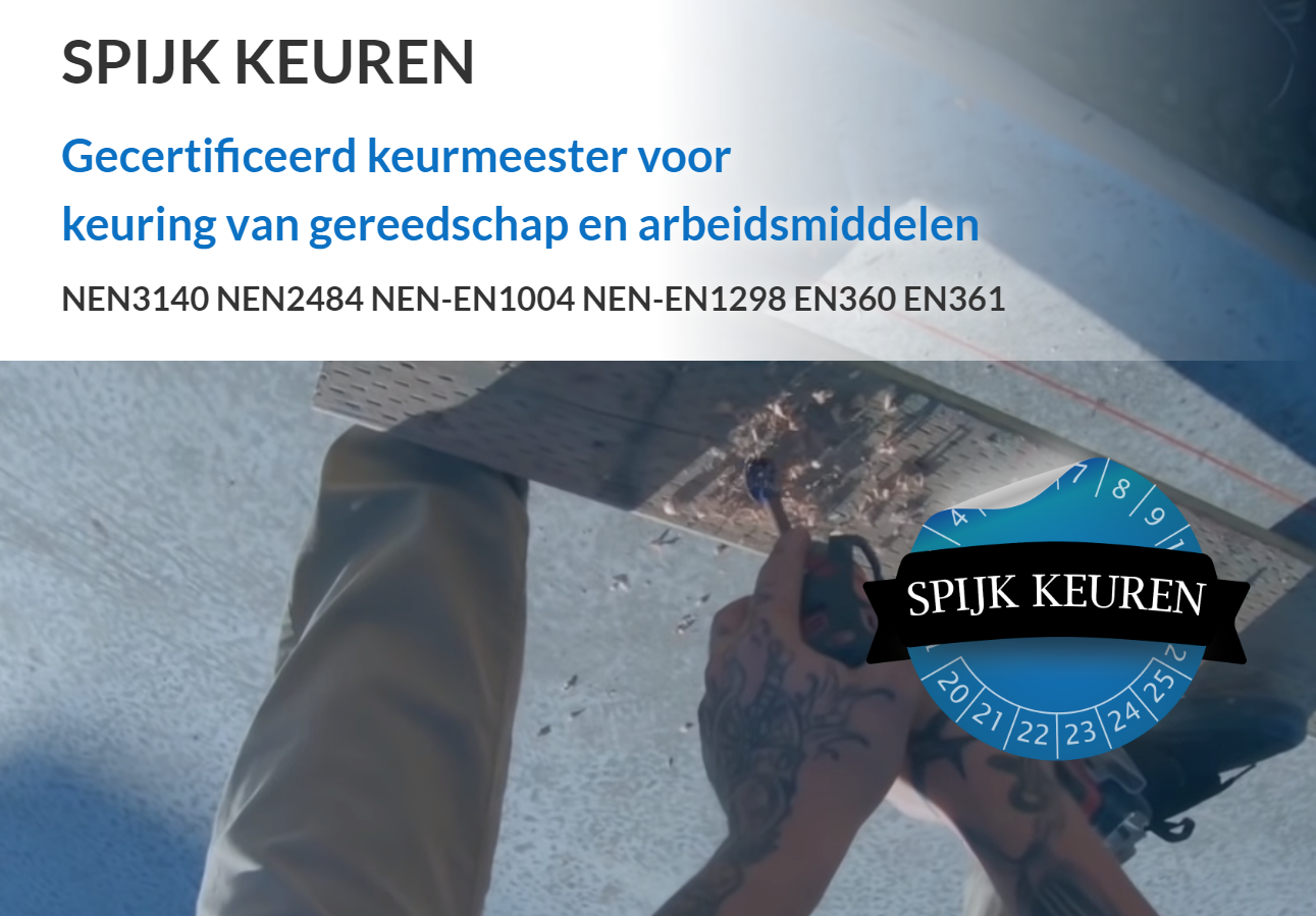
For the startup company Spijkkeuren I got to make the logo. Spijkkeuren is focusing their work on testing and approving of working tools and other work equipment through legal guidelines. Spijkkeuren is making sure companies comply with the legal obligation to work with safe work equipment.
To get to know this startup company better, I got to meet the founder of the company Ronald den Dunnen.
During the meeting with Ronald den Dunnen, the purpose of the company was discussed extensively. After the story from the founder, ideas were created. Sketches were made on the spot during a co-creation session.
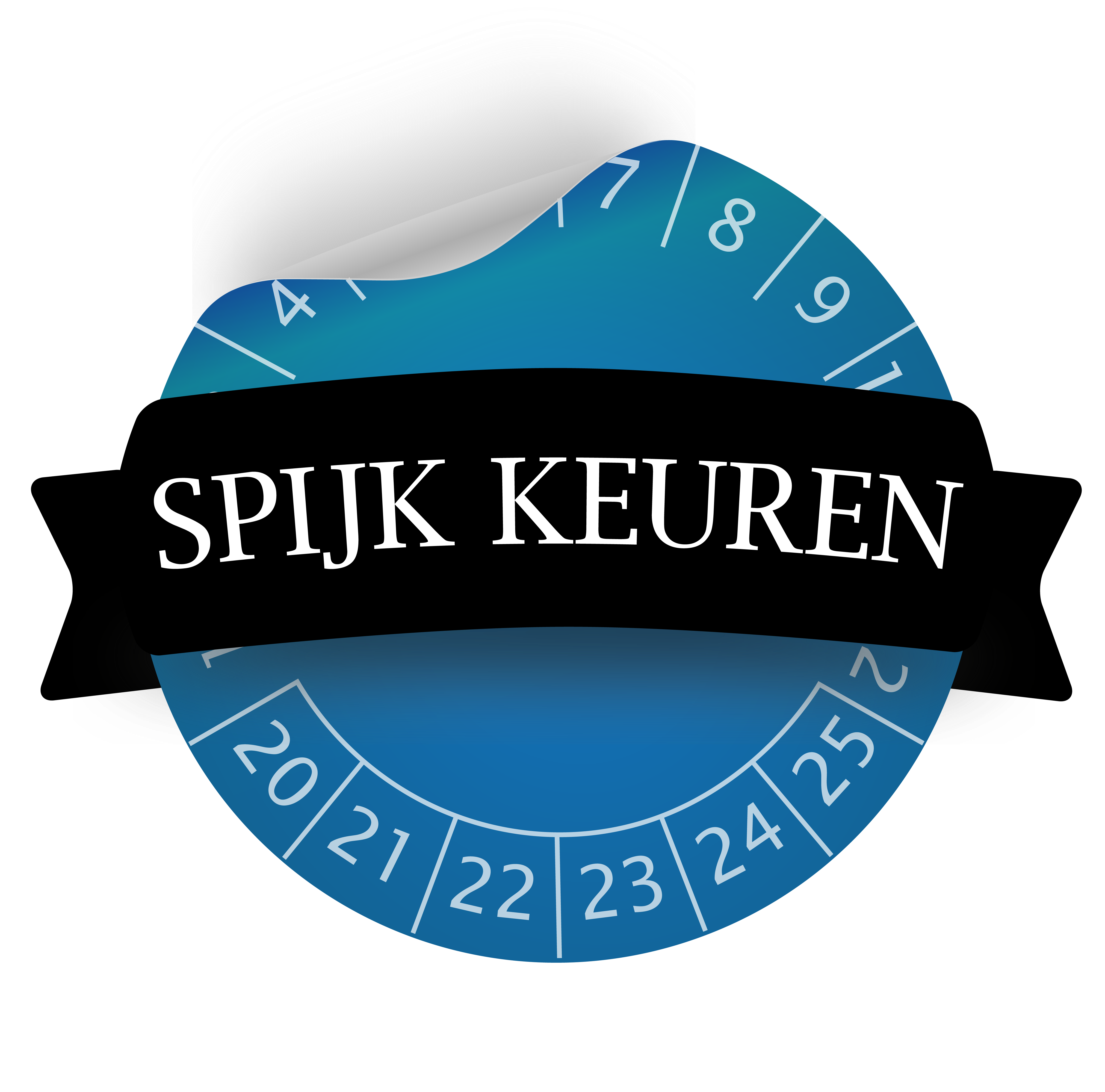
After this co-creating session, I did some research into the different NEN-EN norms. From this research I came across the label for NEN-EN norms, which Ronald den Dunnen will use during his work. This has led to a new brainstorm with new sketches.
After having presented a number of concepts, the design was chosen with the NEN-EN sticker and this was visualized with Illustrator.

In the design for the logo, I used a NEN-EN sticker. By not making the sticker flat, but adding movement, the sticker factor comes to life. The name of the company is shown with an overlapping label.
Because the company revolves around the safety of tools and other work equipment by inspecting them according to the NEN-EN norms, the color blue has been chosen, which stands for safety and trust.
Furthermore, the client has chosen for a simplistic and understandable design.